Bitcoin Logo Concept and History
Nowadays, Bitcoin is a synonym of Digital Currency. Anywhere anyone can recognize this digital Asset through the Bitcoin logo. Meanwhile, the logo design is based on simplicity and relevancy.
Bitcoin is one of the most popular cryptocurrencies in recent days around the Globe. And, Cryptocurrency is a digital currency. Unlike others, the government or bank does not manage these currencies. In this article, you will explore the Bitcoin logo history, color story, and designed updates.
Evolution of the Bitcoin Logo:
Like other latest industry trends, the Bitcoin logo has evolved and has an elegant version.
Surprisingly, the bitcoin logo has been updated two times. Also, the changes are prominent in updated Bitcoin logos. The designer creatively designed to elaborate the essence of digital assets and the modern world. Meanwhile, the latest version has been unchanged for a decade, and its popularity has increased yearly. It has been added to Google Keyboard as well.
Thus, this revolutionary currency, Bitcoin, was launched by Santoshi Nakamoto in 2009.
Bitcoin Logo Updates:
The initial design of the Bitcoin logo differed from the current design. Because it is a combination of different versions. Following are the design updates and changes to the logo.
First Update:

In August 2008, the world experienced a wave of financial crisis. During this period, an anonymous registered a domain with bitcoin.org.
Santoshi Nakamoto revealed the first Logo in 2009. The color theme was golden with the initials of Bitcoin, like BC.
Second Update:

Later on, the Bitcoin logo came with changes in February 2010. This time, the inspiration was taken from the US dollar. However, the coin remains the same.
The coin came with only the latter B instead of BC. Also, the designer changes the position and style of B. However, despite the US Dollar, the B contains two strokes. Also, the strokes did not cross the letter B but were visible from top to bottom. Hence, this part makes it different from the dollar sign.
Final Update:

The second update of the Bitcoin logo design was placed in November 2010. One team member, Phill Wilson, makes changes in the second edition. This time, the flat background and Stylized letter B. He took inspiration from the master card. Hence, the final design combines US dollars and master cards.
This time, both the first and second updates merge and are converted into a simple and flat design. Meanwhile, the inspiration for the US Dollar and Master card remains the same.
Thus, the B came with white color while the background converted into orange color. Also, in the final update, the B is slightly tinted to its position, and you find it a bit rotated and less than 90°.
Significance of Bitcoin Logo:

According to Bitcoin’s website, the inspiration for the color is the alpha channel of an inverted logo. However, there is not such an extraordinary thought process behind it. Also, any other color would work the same.
Initially, the color was white, but due to difficulty in printing, it converted into orange. The orange color was finalized during the open source period, while in 2015, it again moved back to white when Bitcoin launched the 1.0 version.
Following is a detailed explanation of Bitcoin Logo Colors.
Orange:
The current Bitcoin Logo color is orange. Now, it is known as the financial industry’s attractive design. The filled color is under the circular element of the logo.
Notably, the orange represents Success, change, and creativity. However, the orange color is also known for friendship, peace, ambition, and freedom. Hence, in this case, the orange represents all these emotions.
White:
White is the pretty dominant color and the symbol of peace. It enhances the charisma of Letter B. Also, the stylish font letter B creates a wholesome impact in the Bitcoin logo.
White represents simplicity, security, and protection. Meanwhile, white is used for goodness and lightness.
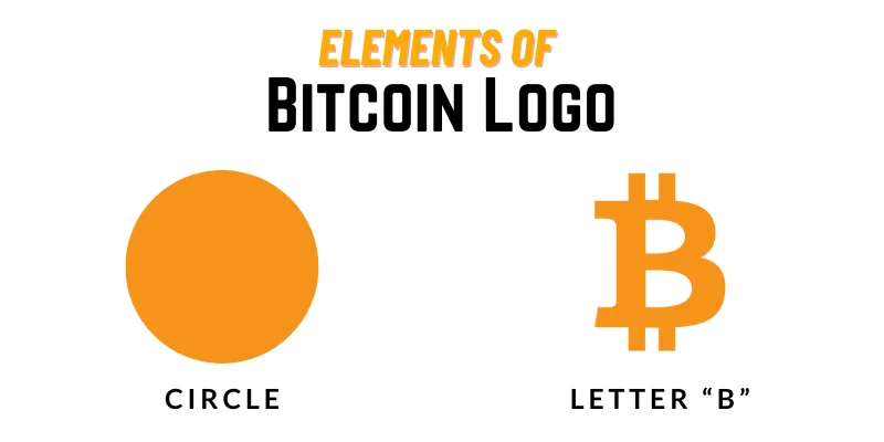
Elements of the Bitcoin Logo:

Currently, Bitcoin is considered a piece of creativity. Since the logo followed all the design rules, however, its simplicity is the crucial element of its popularity. In recent days, the logo has been well-recognized while comprised of only two colors and the customized letter B.
Circle:
The Bitcoin circle contains an orange color to align the financial identity purposely. It allows people to send and receive money anywhere in the Globe. Hence, this is the reason for choosing the element of the circle.
According to psychology, a circle represents infinity, eternity, and timelessness.
Symbol B:
Currencies have a specific and representative symbol for their recognition. Similarly, Bitcoin’s typical and representative symbol is the letter “B.”
Letter B contains two strokes from top to bottom inspired by the US dollar. Meanwhile, the stylized and customized sign of the letter “B” represents the network and bitcoin currency. Thus, B is the prominent recognition element of the Bitcoin Logo.
Success reason for Bitcoin Logo:
The unique thing about this currency is it is not backed with any material resources like other currencies, such as euros, dollars, etc. Cryptocurrencies are supported by a system called blockchain.
Surprisingly, the Bitcoin logo catches people’s attention very quickly. The following are the reasons for its successful recognition.
- Successful companies prefer simple elements in their logo instead of using complex design elements. Simplicity is the secret of Bitcoin’s logo. Thus, a clean look and appearance make it noticeable and recognizable.
- The design of the logo is aesthetic and pleasing to the eyes. The balanced combination of colors and customized letter B creates a wholesome impact for the viewer.
- A prominent trademark and symbol is mandatory in a highly competitive market. Bitcoin knows this secret and creates the stylish letter B to make it visible in the market.
- The color combination in the Bitcoin logo speaks loudly regarding its financial status in the market. Hence, the hidden message is delivered to its audience.
FAQs
What is the concept of the Bitcoin logo?
The logo has a circle and the letter B with two verticle lines. The concept is to show the decentralization authority with the ability to bypass traditional financial institutions.
The final logo has taken inspiration from Dollar and Master Card.
Who was the designer of the Bitcoin Logo?
Satoshi Nakamoto was the designer of the logo. It was designed through different phases. The latest design has been unchanged from the last ten years.
Does the Bitcoin Logo change over time?
Yes, the latest logo is a combination of different versions. Meanwhile, the newest logo was designed by Satoshi Nakamoto.
Final Verdict:
The Bitcoin logo combines different emotions like relevancy, simplicity, and classic look. Because of these emotions, it become so popular not only in the financial institutions but the people. The simplest elements, the circle and letter B, have been used to create the Bitcoin Logo. Keep in mind that bitcoin is a volatile asset. Hence, keep taking advice from experts before investing in it.

